 how-to
Maintaining Brand Consistency on Custom Glassware
Table of Contents
- Step 1: Lock Down Your Brand Assets Before You Order
- Vector File Requirements for Engraving: Getting the Artwork Right
- Logo Placement Guidelines for Glassware: Where It Works and Where It Doesn't
- Step 2: Approve a Physical Proof Before Full Production
- Custom Glassware for Corporate Hospitality: Matching Brand to Occasion
- Step 3: Quality Control and Batch Consistency Across Reorders
- Common Mistakes That Break Brand Consistency on Custom Glassware
- Frequently Asked Questions
Last Updated: September 13, 2026
Step 1: Lock Down Your Brand Assets Before You Order
Brand consistency on custom glassware starts with locking down the exact assets your supplier will work from, because glass is unforgiving: an etched logo cannot be colour-corrected after firing, and a reorder from a different file will not match the first batch.
Before you request a quote, assemble one master folder containing:
- Your primary logo in vector format, plus any approved monochrome version
- Exact colour codes (Pantone, CMYK and RGB) for every brand colour
- Approved typefaces, with the weights you actually use
- Minimum size and clear-space rules from your brand guidelines
- A one-page summary of tone of voice for any accompanying copy
Treat that folder as the single source of truth. Every order, every reorder, every new supplier draws from it and nothing else.
The Non-Negotiables: Logo, Colour Codes and Typography
Three elements decide whether your glassware reads as one coherent brand or a collection of near-misses: the logo, the colour palette and the typography.
Your logo needs a defined "glass-safe" version: fine detail, thin strokes and small text disappear when etched into curved glass, so most brands need a simplified drinkware variant. Colour matters less than you'd think on clear glass, since etching reads as frosted white or, with colour fill, a single flat tone. Typography is the quiet workhorse, a consistent typeface across glasses, coasters and packaging ties the set together.
Vector File Requirements for Engraving: Getting the Artwork Right
Engraving and etching require vector artwork. A vector file defines your logo as mathematical paths, so it scales to any size and converts cleanly into the cutting or masking data production needs. Raster files cannot do this.
Why a JPEG Will Fail and What to Send Instead
A JPEG is a grid of coloured pixels: zoom in and the edges of your logo are approximations, not true lines (adobe.com). Converting that into engraving paths means tracing by hand or auto-trace software, either way, the result is not your logo.
Send vector files instead: .ai, .eps, .pdf (vector-saved) and .svg. If you only have a JPEG, a designer can redraw it as vector, budget for that step and approve the redraw before production.
| File Format | Suitable for Engraving? | Why |
|---|---|---|
.ai / .eps |
Yes | True vector paths, fully scalable |
.svg |
Yes | Vector, widely supported |
Vector .pdf |
Yes | Vector data preserved on export |
.png |
No | Raster, edges approximate |
.jpg |
No | Raster, compression artefacts |
.gif / .webp |
No | Raster, low detail |
One more requirement: convert all text to outlines before sending. If your logo uses a font the supplier doesn't have, outlined text guarantees the letterforms stay exactly as designed.
Logo Placement Guidelines for Glassware: Where It Works and Where It Doesn't
Logo placement guidelines for glassware exist because the vessel's shape dictates what's possible: a tapered champagne flute, a curved beer stein and a stemmed wine glass each offer a different usable area.
The general rules:
- Front-facing, eye-level placement reads best on tumblers and steins, where a flat or gently curved panel gives clean results.
- Base or foot placement suits wine glasses and flutes, keeping the bowl clear while still branding the piece.
- Avoid tight curves and stem joins. Etching across a sharp radius distorts the logo, and thin stems can't hold fine detail.
- Respect the pour line. A logo sitting where liquid or condensation collects looks worn within a single event.
Consistency across a set matters as much as placement on a single glass: if your tumblers carry the logo front-centre, your wine glasses should carry it in an equally deliberate, repeatable position.
Step 2: Approve a Physical Proof Before Full Production
Never approve a full production run from a digital mock-up alone: a screen preview cannot show how etching catches light, how a colour fill reads against clear glass, or whether your logo sits comfortably in the hand.
Ask for a physical proof: a single decorated glass made with your actual artwork and technique. Hold it under different lighting, check the logo's size against your brand guidelines, confirm placement matches your specification, and wash it once to see how the finish behaves.
This step costs time, and it's worth every day. A proof catches problems while they're cheap to fix. A full run of five hundred glasses with a logo 3mm too low catches nothing until the boxes are open.
Custom Glassware for Corporate Hospitality: Matching Brand to Occasion
Custom glassware for corporate hospitality works best when the vessel, decoration technique and occasion are specified together. Most brand guides treat glassware as a single category, but the material and technique determine what your logo can look like, and whether the piece suits the moment.
Match the technique to the glass, because the glass constrains the brand:
- Laser etching on clear soda-lime glass produces a frosted white mark. It is durable, dishwasher-safe and reads cleanly, but it cannot reproduce a brand colour. If your identity depends on a specific hue, etching alone will not deliver it.
- Colour fill on etched glass adds a single flat tone into the etched recess. It restores one brand colour but not gradients, and the fill can fade faster than the etch under commercial washing, so it suits gifts and low-turnover pieces more than service ware.
- Ceramic printing (screen or pad printing) on glass can hold a closer colour match and finer detail than etching, but adhesion depends on the glass surface and the cure. On curved or tapered vessels, print distortion increases toward the edges, so artwork must be pre-distorted to compensate.
- Sandblasting gives a deeper, more uniform frost than laser etching and handles larger coverage areas well, but it is slower and typically better suited to short runs or premium pieces than to volume.
Once the technique is fixed, match the piece to the setting:
- Client appreciation gifts suit a quality stemmed glass or decanter where the object is kept and used. A single etched mark plus a colour-filled accent often reads as more considered than a busy multi-colour print.
- Conferences and launches favour tumblers and flutes in volume, where consistency across hundreds of identical pieces matters more than individual detail. Standardise one technique, one placement and one size across the whole run.
- Wineries and breweries need glassware that survives commercial washing, so prioritise etch or sandblast over colour fill, and specify a glass that tolerates repeated cycles without clouding.
- Internal events and milestones often call for a smaller run with more personalisation, such as names or dates alongside the logo. Keep the logo treatment identical to your standard so the personalised pieces still read as brand assets.
The throughline is restraint and specification. One well-placed mark on a good glass, produced with a technique the material supports, outperforms a busy design forced onto a shape or finish that cannot hold it.
Supply Chain Consistency Across Multiple Vendors
Hospitality programmes rarely run through a single supplier forever. A venue group may order steins from one manufacturer, flutes from another and printed tumblers from a third, and each vendor interprets the same artwork differently unless you control the specification.
The practical controls are:
- A locked specification sheet per product, recording the technique, the artwork file version, the placement in millimetres from a named reference point (rim, base or handle), the mark size and the approved proof reference.
- A single approved proof per product line, held by you rather than the vendor, so a new supplier can be measured against a physical standard rather than a description.
- A pre-production proof requirement written into every purchase order, so no vendor ships volume without a signed-off sample.
- A named brand contact on your side who owns the master files and approves deviations, so vendors are not making judgement calls about what "close enough" means.
When you switch vendors, supply the full specification and approved proof, and require a new proof before the first volume run. A new vendor working from the same file will still produce a different result if their etch depth, masking or cure differs, the proof catches that before it reaches your shelves.
Step 3: Quality Control and Batch Consistency Across Reorders
Batch consistency is where most brand programmes quietly fail: the first order looks perfect, then the quarterly reorder arrives with a logo slightly larger, lighter or a few millimetres off. Across a shelf of glasses, those small differences read as carelessness. Establishing rigorous production standards remains the only reliable way to build brand consistency across every subsequent shipment.
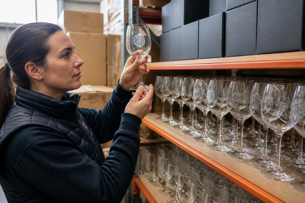
Consistency comes from controlling three things: the artwork file, the production specification and the supplier relationship. Keep the approved vector file locked and versioned, record the exact specification (technique, placement, size) alongside the approved proof, reorder from the same supplier using that record, and request a proof from the new batch before it ships in volume.
What to Check When Your Delivery Arrives
Inspect a sample from each box, not just the top layer. Check the logo's size and placement against your approved proof, confirm the finish is even with no cloudy patches or missed areas, and run one glass through a wash cycle to confirm the decoration holds. Document anything that differs, with photos, before distributing.
If something is off, raise it immediately. The sooner a batch discrepancy is reported, the more options you have.
Common Mistakes That Break Brand Consistency on Custom Glassware
Most consistency failures trace back to a handful of avoidable errors specific to decorated glassware, where the material and production process create failure modes that do not exist in print or digital branding.
- Sending raster artwork. A JPEG or PNG forces guesswork at the production stage. Always supply vector, with text converted to outlines.
- Approving from a digital mock-up. Screen previews hide how etching catches light, how a colour fill reads against clear glass and how the mark sits in the hand. Insist on a physical proof.
- Ignoring material limits. Fine strokes, small text and tight curves disappear when etched into curved glass. A logo that works on a business card will not necessarily work on a tapered flute. Design a simplified, glass-safe variant rather than forcing the original onto the vessel.
- Assuming colour will match. Etching reads as frosted white, not as your brand colour. Colour fill restores one flat tone, not a full palette. If your identity depends on a specific hue, choose a technique that can hold it and test it before committing.
- Losing the master file. When the approved vector lives in someone's inbox, the next reorder starts from scratch. Store it centrally with a version number and a date.
- Changing suppliers without a specification. A new vendor interprets the same file differently. Supply the full specification and the approved proof, and require a pre-production sample.
- No version control. Without a single approved file, "the logo" quietly becomes three slightly different logos across product lines.
- Skipping the incoming inspection. Checking only the top layer of a delivery lets batch discrepancies through. Inspect a sample from each box against the approved proof, and document anything that differs with photos before distributing.
- Not testing the wash. A decoration that looks perfect on arrival can cloud, fade or lift after a few commercial wash cycles. Run one glass through a cycle before signing off a large order.
The pattern is clear: consistency on glassware is a documentation and verification problem before it is a design problem. Brands that treat glassware assets as carefully as website assets, locked files, recorded specifications, physical proofs, rarely run into trouble.
Frequently Asked Questions
How do you maintain brand consistency across multiple glassware orders?
Maintaining brand consistency starts with a locked brand asset file: exact colour codes, approved logo versions and typography specifications. Supply your glassware supplier with vector artwork and a signed-off physical proof from the first order. On reorders, reference that original proof number so the production team matches the same etch depth, placement and finish. Ask your supplier to keep your artwork on file and confirm they archive proofs for repeat runs. This prevents the colour shifts and placement drift that happen when a new operator interprets your logo from scratch.
What vector file requirements for engraving should I send my supplier?
Send your logo as an SVG, EPS, AI or PDF file with all text converted to outlines or curves. Vector files store shapes as mathematical paths, so they scale to any glass size without losing sharpness. Raster files like JPEG or PNG pixelate when enlarged, which produces ragged edges on an etched surface. If you only have a raster logo, ask a designer to trace it into vector format before production. Include a single-colour version too, because etching produces a frosted white mark, not full colour.
How do logo placement guidelines for glassware differ from printed merchandise?
Glassware is curved and often transparent, so placement rules differ from flat printed items. Keep the logo at least 10mm from the rim and base to avoid weak etch areas and awkward viewing angles. Centre the mark on the side that faces the drinker when held in the right hand. For tapered glasses, place the logo where the surface is closest to vertical, otherwise the curve distorts the shape. Always approve a physical proof on the actual glass shape before a full run.
How do you prevent fading or wear on etched glassware used in commercial dishwashers?
Etching and engraving remove a thin layer of glass, so the mark is permanent rather than printed on top. Fading usually happens with surface-printed or decal decoration, not true etching. To protect any custom glassware, wash at lower temperatures where possible, use a mild detergent and avoid abrasive scourers. Check with your supplier that the decoration method is true etch or sandblast rather than a printed transfer, and ask how the mark performs after repeated commercial wash cycles before you commit to a large order.