 how-to
Ensure Consistent Logo Colour on Custom Glassware
Table of Contents
- Why Consistent Logo Colour Matters on Custom Glassware
- Pantone Colour Matching for Glassware: The Foundation
- Custom Glassware Artwork Requirements: File Preparation
- Screen Printing vs Digital Printing on Glass: Which Technique Ensures Colour Consistency
- The Proofing Process: Your Colour Consistency Checkpoint
- Material Quality and Surface Compatibility
- Maintaining Colour Consistency Across Production Runs
- Conclusion
Last Updated: August 26, 2026
Why Consistent Logo Colour Matters on Custom Glassware
Your brand's identity lives in the details. When a client picks up a branded glass, that logo needs to speak with the same voice every time. Inconsistent logo colour undermines brand recognition, damages perceived quality, and signals carelessness. Ensuring consistent logo colour isn't a nice-to-have, it's foundational to making your promotional investment work.
At The Glassware Company, we understand the importance of colour consistency. The good news: inconsistency is preventable. It requires understanding how colour translates to glass, preparing artwork correctly, choosing the right printing technique, and validating work before production scales up.
Pantone Colour Matching for Glassware: The Foundation
Pantone Matching System (PMS) is your anchor point for colour consistency. Unlike digital screens where colours shift based on calibration, Pantone gives you a physical reference that printers and engravers use to dial in your exact colour, batch after batch.
When you specify a Pantone colour for custom glassware, you're saying: "This is the colour I want. Match it to this physical swatch." That swatch becomes the standard against which every production run is measured. Without it, you're relying on interpretation, and interpretations drift.
The challenge is that Pantone inks don't always translate perfectly to glass. A Pantone colour specified for paper behaves differently when applied to a curved, reflective, transparent surface. Light passes through glass, bounces off the substrate, and interacts with the engraving or ink layer differently than on paper. Your colour can appear darker, lighter, or shift in hue depending on the printing technique used.
Understanding CMYK vs RGB in Glass Printing
RGB (Red, Green, Blue) is the colour model your screen uses. It's additive; colours are created by mixing light. When you design your logo in Adobe Illustrator and view it on your monitor, you're seeing RGB. The problem: RGB colours don't directly translate to physical inks on glass.
CMYK (Cyan, Magenta, Yellow, Black) is the colour model used in traditional printing. It's subtractive; colours are created by absorbing light with pigmented inks. CMYK is closer to what you'll get on glass, but still not perfect.
Pantone sits above both. It's a standardised ink formula. When you specify Pantone 286 (deep blue), you're saying: "Mix inks to this exact formula." For custom glassware, Pantone is your insurance policy against colour drift.
When preparing artwork for custom glassware, ask your supplier whether they work with Pantone references. Provide your logo in both RGB (for visual reference) and as a Pantone-specified design file.
Selecting Your Pantone Reference
Choosing the right Pantone colour for glassware requires seeing how it looks on glass, not just on paper. Order a Pantone swatch book as a physical reference. Ask your glassware supplier for a sample glass printed or engraved with your top colour options.
A sample costs less than a full production run and saves you from ordering 1,000 glasses in a colour that doesn't match your vision. Document your chosen Pantone number and include it in every conversation with your supplier. When you reorder the same design in six months, reference that Pantone number. It's the thread that ties every batch together.
Custom Glassware Artwork Requirements: File Preparation
Your artwork is only as good as the file you hand over. A poorly prepared design file leads to blurry logos and colour shifts. The right file specification prevents these problems.
Vector Graphics and Resolution Standards
Vector graphics are non-negotiable for custom glassware. Vector files (.ai, .eps, or .pdf) use mathematical formulas to describe shapes and colours. They scale infinitely without losing quality. Your logo printed at 2.5 centimetres or 10 centimetres looks equally sharp.
Raster graphics (JPEGs, PNGs) are made of pixels and become blocky when enlarged. For glassware where your logo might be printed at various sizes, vector is the only option that guarantees clarity. If your logo exists only as a raster file, have it redrawn as a vector.
Resolution for vector files isn't measured in DPI. Instead, focus on line weight and detail. Thin lines (below 0.5pt) can disappear depending on the printing technique ([EXTERNAL_LINK: Printing Industries of Australia insights | printing.org.au]). Ask your supplier what minimum line weight they recommend; typically 0.75pt to 1pt for pad printing or screen printing on glass.
Opacity and Design File Specifications
Opacity determines how transparent or solid your logo appears. A fully opaque logo (100% opacity) is completely solid. For promotional glassware, most designs use 100% opacity so the logo stands out clearly.
When you prepare your design file, specify opacity explicitly. If your logo should be 100% opaque white on clear glass, say so.
File specifications your supplier needs:
- File format: .ai (Adobe Illustrator) or .eps preferred; .pdf acceptable
- Colour mode: CMYK or Pantone (not RGB)
- Fonts: convert to outlines so they don't shift if the supplier lacks your font
- Bleed: include a small bleed if the design extends to the edge
- Dimensions: provide artwork at actual print size, or clearly label the scale
Hand over a clean, organised file. Remove unused layers. Label everything. A five-minute file cleanup prevents hours of back-and-forth with your supplier.
Screen Printing vs Digital Printing on Glass: Which Technique Ensures Colour Consistency
Two main techniques dominate custom glassware production: screen printing and digital printing.
Screen printing uses a mesh screen to push ink onto the glass. Colour consistency is strong because the same screen is used for every print; once you dial in the ink mix and pressure, each glass gets identical coverage. Screen printing excels at solid, vibrant colours. The downside: setup costs are high, so it makes sense only for larger orders (typically 100+ units).
Digital printing works like an inkjet printer scaled up for glassware. It sprays tiny dots of colour directly onto the glass. Digital printing is flexible; you can print different designs on different glasses in the same batch without resetting equipment. Colour consistency depends on the printer's calibration. Digital printing is ideal for smaller runs or complex, multi-colour designs.
For consistency across multiple production runs of the same design, screen printing has a slight edge.
Pad Printing for Precise Colour Control
Pad printing is a hybrid technique that deserves mention for colour consistency. A rubber pad picks up ink from an engraved metal plate and transfers it to the glass. Pad printing is exceptionally precise and can reproduce fine detail and sharp edges.
Colour consistency with pad printing is excellent because the metal plate is the permanent master. Every impression comes from the same plate, so colour and detail remain identical across batches. Pad printing is ideal for smaller logos or intricate designs and works well for curved surfaces like beer steins or wine glasses.
Laser Engraving for Durability
Laser engraving doesn't use ink. A laser beam vaporises a thin layer of the glass surface, creating a frosted or etched appearance. For colour consistency, laser engraving is unbeatable. The engraved mark is permanent; it's part of the glass itself.
The limitation: laser engraving can't reproduce full-colour designs. It's monochromatic. But for logos that work in a single colour (most do), laser engraving delivers absolute consistency across production runs and over the glass's lifetime. Many businesses choose laser engraving for premium glassware precisely because durability and consistency are unmatched.
The Proofing Process: Your Colour Consistency Checkpoint
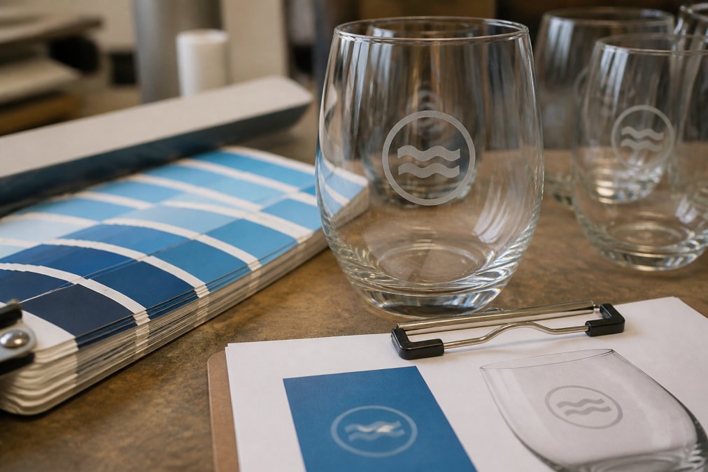
A proof is your final checkpoint before production scales up. It's a sample glass produced using your exact artwork, colour specifications, and chosen printing technique. You approve the proof, and then the supplier uses it as the reference for the full production run.
The proofing process:
-
Submit your artwork and colour specifications to your supplier, including the Pantone reference, design file, and special instructions.
-
Receive a digital mock-up or physical sample. A physical sample is more valuable because you see the actual colour on actual glass under actual light.
-
Review the proof carefully. Does the logo match your Pantone reference? Is the text readable? Is placement correct?
-
Request revisions if needed. If the colour is off, ask the supplier to adjust the ink mix and produce another sample. This is the time to get it right before 1,000 glasses go through production.
-
Approve in writing. Once satisfied, give written approval. This becomes the production standard.
Material Quality and Surface Compatibility
The type of glass you choose affects how colour appears and how well it adheres.
Clear glass is the standard. Colours appear true because there's no tint to shift the hue. Logos stand out crisply.
Frosted or satin glass has a textured surface that diffuses light. Colours appear softer and more subtle. Engraved logos blend beautifully with frosted glass. Printed logos on frosted glass can appear less vibrant than on clear glass because the texture scatters light.
Coloured glass (amber, blue, green) adds brand personality but complicates colour consistency. A logo printed in white on amber glass looks different than the same white logo on clear glass. Order a sample to see how your chosen colour looks on your chosen glass colour.
Surface texture matters for ink adhesion. Smooth glass accepts ink cleanly. Textured or heavily frosted surfaces can cause ink to sit unevenly. Your supplier will know which surfaces work best with their printing method.
The quality of the glass itself affects durability. Thicker glass (3mm or more) is more durable than thin glass. For glassware used frequently or washed in commercial dishwashers, thicker glass is worth the investment.
Maintaining Colour Consistency Across Production Runs
Your first batch is perfect. Six months later, you reorder the same design, and the colour comes back slightly different. This happens because production conditions vary. A different operator may adjust the ink mix slightly. Ambient temperature or humidity affects how ink flows. Equipment drifts out of calibration.
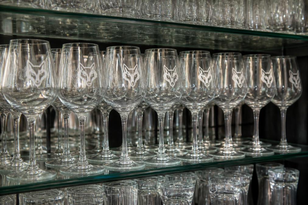
To prevent colour drift, establish a consistency protocol with your supplier:
1. Document your approved proof. Keep the physical sample or a high-quality photo. When you reorder, send it along with your request.
2. Reference the Pantone number every time. Every purchase order should state the Pantone colour. Example: "Logo in Pantone 286 (Process Blue), 100% opacity."
3. Request a pre-production sample for large orders. If ordering 500+ units, ask the supplier to produce a small sample batch (5-10 glasses) before committing to the full run ([EXTERNAL_LINK: Promotional Products Association Australia advice | ppai.org.au]).
4. Inspect the first delivery. Check a random sample of glasses. Compare them to your approved proof. If something's off, flag it immediately.
5. Keep records. Document the Pantone number, supplier name, production date, and notes about the batch.
Troubleshooting Common Colour Shifts
The logo appears darker than approved. The ink coverage is heavier than the proof. Ask the supplier to dial back the ink mix and produce a new sample, referencing your approved proof explicitly.
The logo appears lighter or washed out. Insufficient ink coverage. Request increased ink saturation.
The colour has shifted in hue. The ink formula has drifted from your Pantone reference. Ask the supplier to verify their Pantone reference against a physical swatch and request a new sample using freshly calibrated ink.
The colour is inconsistent within the batch. Some glasses are darker, some lighter. This indicates inconsistent application. Request the supplier inspect and service their equipment.
The colour fades quickly after delivery. If the logo fades within weeks, the issue is usually adhesion or UV sensitivity. If your glassware will be used outdoors or exposed to sunlight, specify UV-resistant ink when you order.
Post-Production Care and Durability
Hand washing is gentler than machine washing. Avoid abrasive scrubbers that can scratch the logo.
Commercial dishwashers are hotter and more aggressive. If your glassware will go through a commercial dishwasher, choose a printing or engraving technique that can withstand that environment. Laser engraving is the most durable.
Avoid bleach and harsh chemicals. These can degrade inks and cause colours to fade or shift.
Storage matters. Store glassware in a cool, dry place away from direct sunlight. UV exposure can cause some inks to fade over time.
Ensuring consistent logo colour on custom glassware is a technical challenge, but it's entirely solvable with the right process. The Glassware Company offers expertise in engraving and etching onto glassware, a large range of styles, and customisation with your logo or artwork of choice, backed by years of industry experience. We are dedicated to maintaining the highest standards of product quality and service, ensuring your artwork is on point and your brand stands out. Get an online quote and see how we ensure your brand shines on every glass.
Frequently Asked Questions
How do I provide artwork files to ensure colour accuracy on custom glassware?
Submit artwork as vector graphics in formats like AI or PDF. Use CMYK colour mode, not RGB, since printing processes render CMYK accurately on glass. Include a Pantone reference number alongside your colour specification. Avoid embedding fonts; convert text to outlines. Ensure your logo has sufficient opacity and contrast against the glass substrate so the colour reads clearly during production and after washing.
What is the difference between screen printing and pad printing for logo colour consistency?
Screen printing deposits ink through a fine mesh onto flat or curved surfaces, offering vibrant colour saturation and excellent uniformity across large production runs. Pad printing uses a silicone pad to transfer ink to uneven surfaces like curved glassware, providing precise colour control on complex shapes. Both methods use CMYK or Pantone inks; the choice depends on your design complexity and glassware geometry. Laser engraving, by contrast, removes the glass surface to reveal contrast without ink, ensuring permanent colour consistency.
How can I ensure my brand colours match across different glassware materials?
Specify your brand colour using Pantone Matching System (PMS) numbers rather than RGB values. Test your design on the exact substrate you'll order (clear glass, frosted, coloured) before full production, as surface texture and transparency affect colour appearance. Request a digital mock-up and physical proof showing your logo on the actual glassware type. Ask your supplier about adhesion and opacity standards for your chosen printing or engraving technique. Document your approved proof as the reference for all future batches.
Why does my engraved or printed glassware sometimes fade after dishwasher use?
Fading typically occurs when ink adhesion is poor, the surface wasn't properly prepared, or the finishing method lacks durability. High-quality pad printing and laser engraving bond permanently to glass and withstand commercial dishwashers when applied correctly. Ensure your supplier uses durable finishing methods and tests print durability before shipping. Ask about their adhesion standards and whether they apply protective coatings. Proper post-production care, such as air-drying or hand-washing the first use, can extend the life of printed designs.
This article was written using GrandRanker