 how-to
Design Branded Glassware Logos: A Step-by-Step Guide
Table of Contents
- Understanding Your Glassware Type and Shape
- Custom Glassware Logo Design Best Practices
- Logo Legibility on Curved Surfaces
- Vector File Requirements for Glass Etching
- Choosing Between Printing and Etching Methods
- Logo Placement and Positioning on Your Branded Glassware
- Proofing, Colour Matching, and Quality Assurance
- Common Design Mistakes to Avoid
- Frequently Asked Questions
Last Updated: September 3, 2026
Design Branded Glassware Logos: A Step-by-Step Guide
Designing branded glassware logos requires a different approach than designing for paper or screens. Curved surfaces, printing methods, and glass-specific constraints demand precision that most designers don't anticipate. This guide walks you through choosing the right glassware type, preparing vector files, understanding etching versus printing methods, and positioning your logo for maximum impact.
Understanding Your Glassware Type and Shape
Before you design a single line, you need to know what vessel you're working with. A logo that works beautifully on a straight-sided beer stein will look distorted on a curved wine glass. The shape, diameter, and surface area of your glassware fundamentally change how your branded glassware logos will appear.
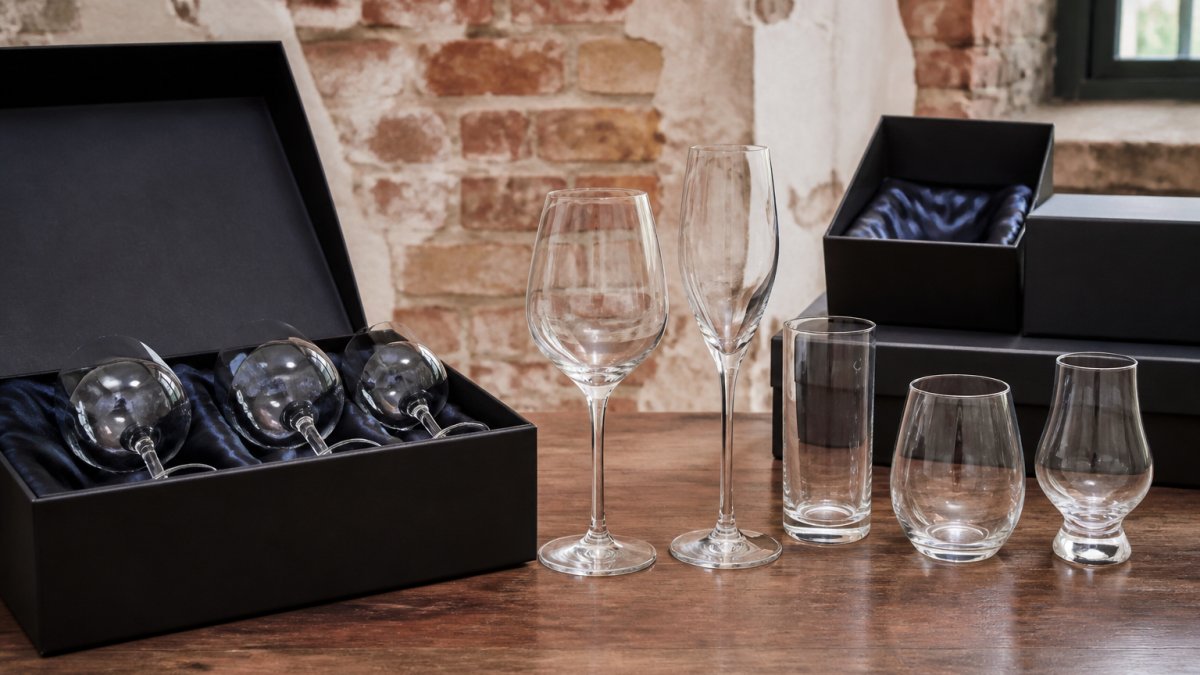
Wine glasses have a bowl that curves inward and outward, requiring your logo to account for optical distortion. Beer steins offer more flat surface area, making them forgiving for larger designs. Tumblers and pint glasses sit between these extremes. When you specify your glassware choice with The Glassware Company, the team will provide exact dimensions and surface area measurements to inform your design scale and placement.
Consider also where the logo will sit relative to the rim, base, and handle. A handle blocks half the surface on a beer stein. The base curves sharply and is harder to read. The area just below the rim is prime real estate on most pieces. Understanding these zones before you brief your designer prevents wasted revisions.
Custom Glassware Logo Design Best Practices
Your branded glassware logos need to work harder than logos on flat surfaces. They're competing with curved geometry, reflected light, and the physical act of holding and drinking. The design principles that matter most are simplicity, scalability, and colour contrast.
Simplicity and Scalability
The biggest mistake is designing too much detail. A logo with fine lines, small text, or intricate gradients will either disappear when etched or become a muddy blur when printed. Simplicity is necessary.
Your logo should read clearly at the size it will actually appear on the glass. If your design will be etched at 40mm wide, test it at that scale. Can you still read the text? Are the line weights consistent? Do thin lines disappear? If yes, simplify.
Scalability means your design should work across different glassware sizes. Build your design with flexibility, using geometric shapes and clear letterforms that scale without losing legibility. Avoid scripts and decorative fonts that thin out at smaller sizes.
Colour Considerations for Etching and Printing
Colour behaves differently on glass depending on your production method. Screen printing allows full-colour designs with solid, vibrant finishes. Laser engraving creates a frosted, monochromatic effect. Imitation etching mimics the frosted look but can include limited colour variations.
For screen printing, your colour palette is nearly unlimited, but remember that ink sits on top of glass. A light colour printed on clear glass will look washed out; a dark colour pops. For laser-engraved or etched designs, think in terms of depth and contrast rather than colour. Your designer needs to understand this to control the visual weight of different elements.
Logo Legibility on Curved Surfaces
Text that reads perfectly on a flat mockup can become distorted, stretched, or illegible when wrapped around a cylinder or curved bowl. The curve acts like a lens: text on the sides appears stretched horizontally; text on a wine glass bowl appears compressed vertically.
Sans-serif fonts are almost always the better choice for curved surfaces. They're cleaner, have consistent stroke width, and read better at small sizes. Script fonts and serif fonts with thin strokes tend to break apart on glass.
Test legibility by printing a mockup and viewing it from different angles. The logo should read clearly when you're holding the glass, looking straight-on, and viewing from the side. If it doesn't, adjust the design before production.
Vector File Requirements for Glass Etching
Your designer must deliver vector files, not raster images. Vector graphics are built from mathematical curves and shapes that scale infinitely without losing quality. Raster images (JPEGs, PNGs) are made of pixels and will look pixelated when enlarged.
DXF and Vector Format Specifications
Most glass etching vendors, including The Glassware Company, accept DXF (Drawing Exchange Format) files or vector files in Adobe Illustrator format (AI, EPS). DXF is the industry standard because it preserves line weights, fills, and layer information that machines need.
When preparing your vector file, ensure all text is converted to outlines (not live text). All strokes should be converted to fills, as engraving machines work with solid shapes. Colours should be in RGB mode for screen printing, or simplified to black and white for etching. The file should have a clear artboard size matching your design area. ensure engraving quality.
Preparing High-Resolution Artwork
Any raster elements (photographs, textures, gradients) need to be high-resolution at 300 DPI at final size (iso.org). A 100mm logo should be supplied at 300 DPI to ensure sharpness.
Include a colour swatch showing exactly what shade of etching or ink colour you want. Colours can vary between production runs without specification. Request a physical sample or digital proof showing exact colour match before committing to a large order.
Provide your file in layers if possible, with clear labels: "Logo," "Text," "Decorative Border," etc. This helps your vendor make adjustments without rebuilding the entire design.
Choosing Between Printing and Etching Methods
Your branded glassware logos can be created using several different methods, each with distinct visual results, durability, and cost implications.
Screen Printing vs. Laser Engraving
Screen printing is the most common method. Ink is pushed through a mesh screen onto the glass surface, producing a vibrant, opaque finish with full-colour capability. It's cost-effective at scale and produces a glossy, professional look. The downside is durability: ink can chip or fade with heavy dishwasher use.
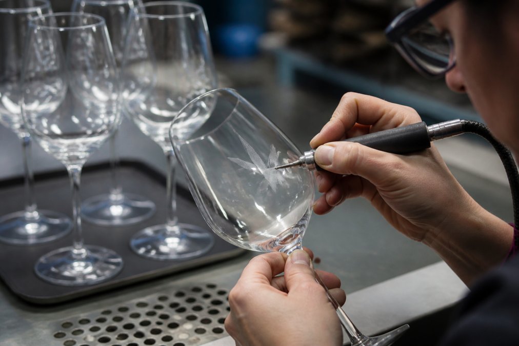
Laser engraving removes a micro-thin layer of the glass surface, creating a frosted, etched appearance (peer-reviewed research). The design is permanent and can't fade or chip because it's part of the glass itself. However, laser engraving is monochromatic and cannot produce full-colour designs.
For corporate gifting and hospitality use, laser engraving is often better because the design lasts indefinitely. For promotional merchandise where durability is less critical, screen printing offers better colour options and sharper detail.
Imitation Etching and Sandblasting Options
Imitation etching mimics the appearance of traditional sandblasted glass, creating a frosted, permanent finish similar to laser engraving but with limited colour variations. It's durable and elegant, popular for wine glasses and high-end hospitality glassware.
True sandblasting is the most labour-intensive and expensive method, creating a deeply frosted, textured finish that's completely permanent. It's typically reserved for one-off or small-batch custom pieces where cost is not a limiting factor.
For most branded glassware orders, imitation etching offers the best balance of appearance, durability, and cost.
Logo Placement and Positioning on Your Branded Glassware
Where you place your logo is as important as the design itself. Poor placement can make an excellent logo look awkward or difficult to see.
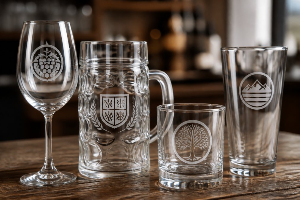
On wine glasses, the logo typically sits on the bowl, centred horizontally. Position it roughly one-third to halfway down from the rim, avoiding the rim (vulnerable to wear) and the base (hard to see).
Beer steins offer more flexibility. The logo can wrap around the body, sit on one side, or be positioned on the handle area. Ensure text reads left-to-right when viewed straight-on, and avoid placing critical elements where the handle blocks them.
Tumblers and pint glasses benefit from front-and-centre placement, roughly in the middle vertically. This makes the logo visible when held and when sitting on a table.
Always request a physical mockup or digital proof showing your exact logo placement before production. The Glassware Company provides proofs to catch placement issues that would otherwise require expensive reprints.
Proofing, Colour Matching, and Quality Assurance
Before your branded glassware logos go into full production, request a proof, a sample piece produced using your exact design, colours, and placement. It's your last chance to catch errors before committing to large quantities.
Request a proof that matches your production method exactly. Colour appearance varies dramatically between methods. When you receive your proof, examine it under the same lighting conditions where the glasses will be used. Hold the glass, drink from it, and view it from multiple angles. Does the logo read clearly? Is the colour what you expected? Is the placement correct?
Colour matching is critical for reorders. Specify your colour using Pantone codes or provide a physical reference sample. Document the exact production settings so future batches can match. The Glassware Company maintains detailed records of every custom order, including colour specifications and production parameters.
Common Design Mistakes to Avoid
Most design problems fall into predictable categories. Logos designed too small become illegible when etched or printed at actual size. A 25mm logo is roughly the size of a postage stamp. Go larger if unsure.
Using raster images instead of vectors is another critical mistake. Insist on vector files in DXF or AI format. Poor colour contrast is equally problematic, a light grey logo on clear glass disappears. Test colour choices on actual glass samples before committing to production.
Overcomplicating the design is common. Thin lines, small text, and fine details are the enemy on curved surfaces. A bold, clean logo will always outperform a detailed one on glassware.
Ignoring the curve is another frequent error. Curved surfaces require different thinking about letter spacing, line weight, and optical balance. Brief your designer on the glassware type and dimensions upfront so they can design with the curve in mind.
Finally, never skip the proof stage. A proof costs a small fraction of a full production run and catches errors before they become expensive.
Designing branded glassware logos that work requires understanding how glass surfaces behave, what production methods can and cannot do, and how to prepare files that vendors can execute flawlessly. The difference between a rushed design and a thoughtful one shows immediately in legibility, durability, and how your clients or guests perceive your brand. When you're ready to move from design to production, The Glassware Company can guide you through proofing, colour matching, and quality assurance. Our team has managed hundreds of custom orders across corporate clients, wineries, breweries, and hospitality venues. Get a quote for your custom branded glassware and work with specialists who understand the technical requirements of glass production.
Frequently Asked Questions
What file formats are best for custom glassware logos?
Vector formats like DXF, AI, and EPS are ideal for branded glassware logos because they scale without quality loss. High-resolution PNG or PDF files (minimum 300 DPI) work for screen printing and laser engraving. Always provide print-ready files with colour separation and transparency layers clearly defined. Ask your supplier which format they prefer, most professional producers accept multiple formats and will advise on the best choice for your chosen etching or printing method.
How does logo complexity affect glass etching quality?
Simpler logos with bold lines and clear shapes etch more cleanly and remain legible on curved surfaces. Overly detailed designs with thin lines, small text, or intricate patterns may blur or fade during etching or printing. Test your design at actual size on the glassware type you're using. Fine details smaller than 2mm often don't reproduce well. Vector graphics with solid fills and minimal gradients perform best across all etching and printing methods.
How do I ensure my branded glassware logo stays consistent across batches?
Request colour samples and proofs before full production runs. Use a professional colour matching system (Pantone or CMYK values) rather than describing colours verbally. Provide high-resolution artwork with locked layers and embedded fonts. Specify ink curing times and surface preparation requirements in writing. Store approved proofs and production specifications for future reorders to maintain branding consistency.
What is the difference between screen printing and laser engraving for branded glassware?
Screen printing applies ink to the glass surface, offering vibrant colours and is cost-effective for large orders. Laser engraving removes a thin layer of glass, creating a permanent mark that won't fade in dishwashers and requires no ink curing. Imitation etching provides a frosted appearance similar to traditional sandblasting but with lower setup costs. Laser engraving suits durability-critical applications like hospitality venues; screen printing works well for promotional merchandise where colour vibrancy matters most.
This article was written using GrandRanker